


As you know, the SAT exam consists of two sections, and one of these sections is dedicated to assessing Reading and Writing skills. The questions in this section are organized in various formats to evaluate students' reading comprehension and writing abilities. One of these question types includes interpreting information presented in informative graphics. By practicing these types of questions during your preparation, you can gain skills such as analysis, quick reasoning, and situational evaluation, and apply the correct strategy to answer the questions with ease. Let’s take a look at some sample questions related to this type.
Analyzing Information
These questions test your ability to examine the information presented in the graphic and draw correct conclusions. You must understand what the graph is about and analyze the provided data carefully. Then, look at the question to clearly understand what is being asked. Let’s explore this in more detail through sample questions.
Before attempting to answer the question, take time to thoroughly examine the graphic. Rushing or reading the table incorrectly may lead to the wrong answer. Make sure you understand every component of the diagram.
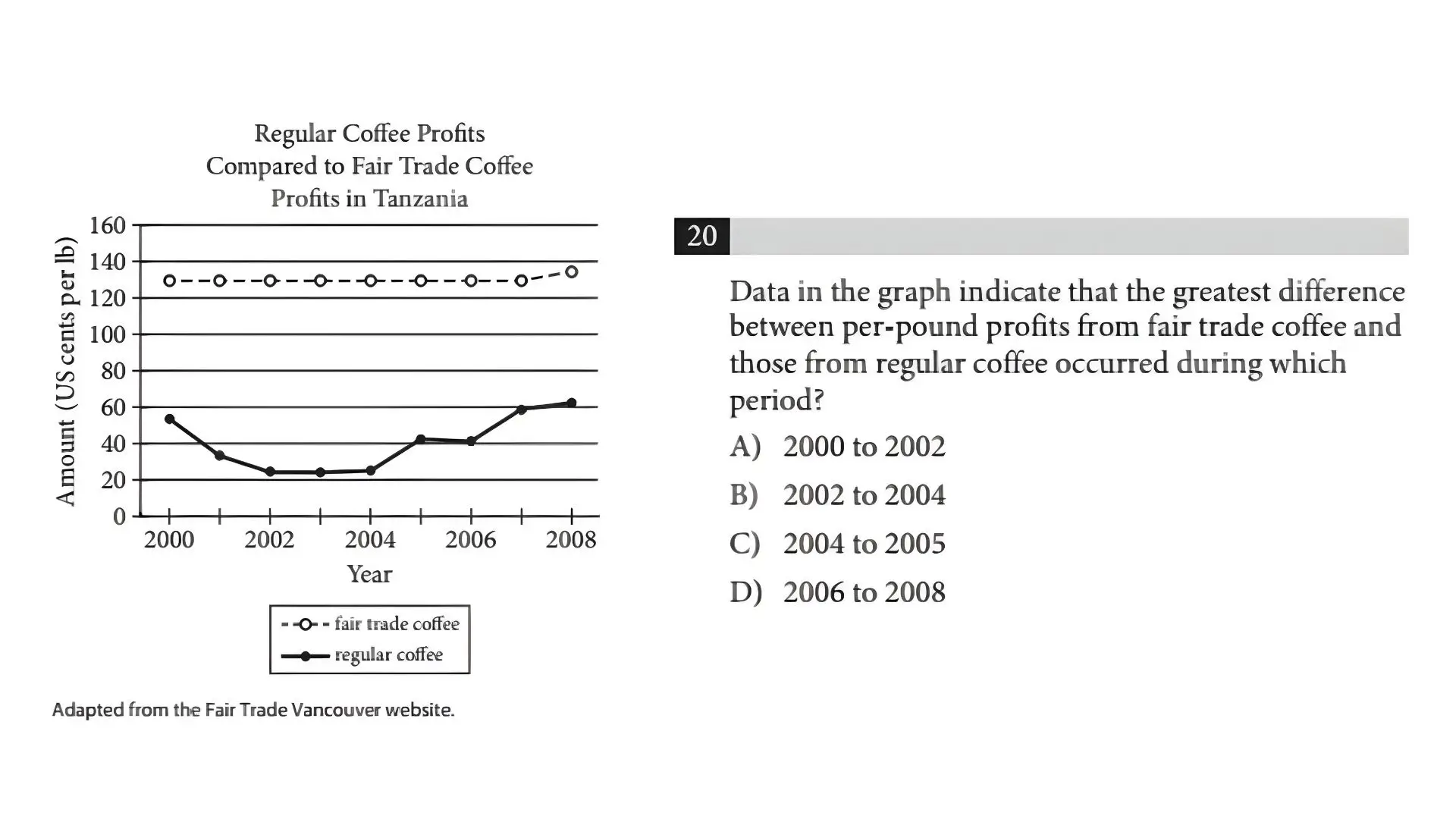
The diagram analyzes and compares changes in profit from fair-trade and conventional coffee trade over the years. The dotted line represents changes in profit from fair trade, while the solid line represents changes from regular trade. The x-axis (horizontal line) indicates the years, and the y-axis (vertical line) shows the profit in US cents per pound.
If we examine the question, it asks us to determine the year during which the difference in profits between fair-trade and regular coffee trade was the greatest. This corresponds to the point on the graph where the distance between the two lines is the largest. When observing how the lines move over the years, we can see that the biggest difference in profit occurred in 2002–2004. The correct answer is B.
Interpreting Information
In these reading-section questions, various interpretations related to a graph are provided, and you are required to select the correct interpretation. To do this, you must read all the options carefully, then refer to the graph and analyze each choice. You should select the interpretation that accurately reflects the information shown in the graph.
The following sample belongs to the writing section. Similarly, you must analyze whether the statements in the answer choices align with the given data.
Answering Based on Region-Specific Information
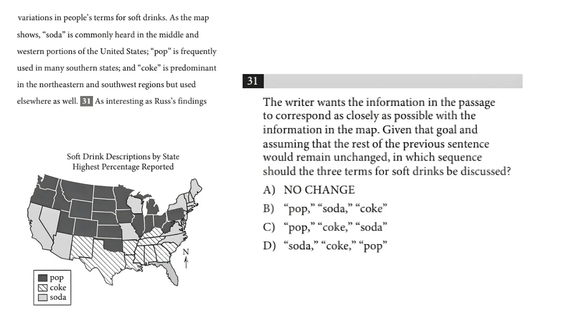
First, determine what the question is asking. Based on the map, we need to find out which terms are used in the central and western, southern, and northeastern/southwestern regions of the United States. The terms must be listed in this order: first central and western U.S., then the South, and finally the Northeast and Southwest.
Next, look at the map to identify which terms are used in which regions. In the central and western parts, the commonly used term is "pop". The dark-shaded area on the map corresponds to the usage of “pop.” In the southern region, "cola" is preferred. The diagonally lined areas indicate the regions where “cola” is used. Lastly, in the northeast and southwest, "soda" is most frequently used, shown with a lighter shaded area. Therefore, the correct sequence is “pop,” “cola,” “soda.” The correct answer is C.
The above question types reflect the kinds of graph-based questions you may encounter in the exam. To answer these questions correctly, you must continuously practice and improve your analytical skills.


